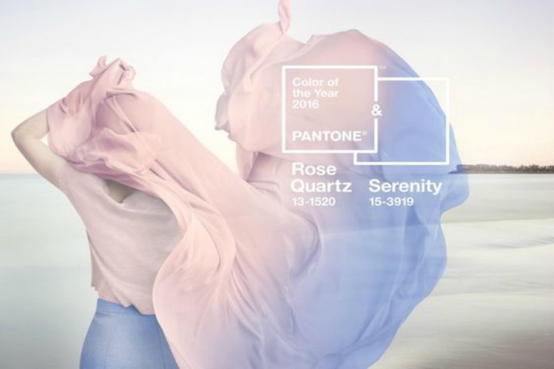
 Photo Credit: Pantone 2016
No one knows colour like Pantone, so when they announce their annual 'colour of the year', the fashion world pays attention. Past colours have ranged from the bold (Tangerine Tango and Turquoise) to the earthy (Marsala and Honeysuckle), but this year they have broken with tradition by going 'pale and interesting' with not one - but two colours.
This year’s Pantone Colour of the Year is a blending of two romantic shades: the light pink Rose Quartz and the silvery blue Serenity.
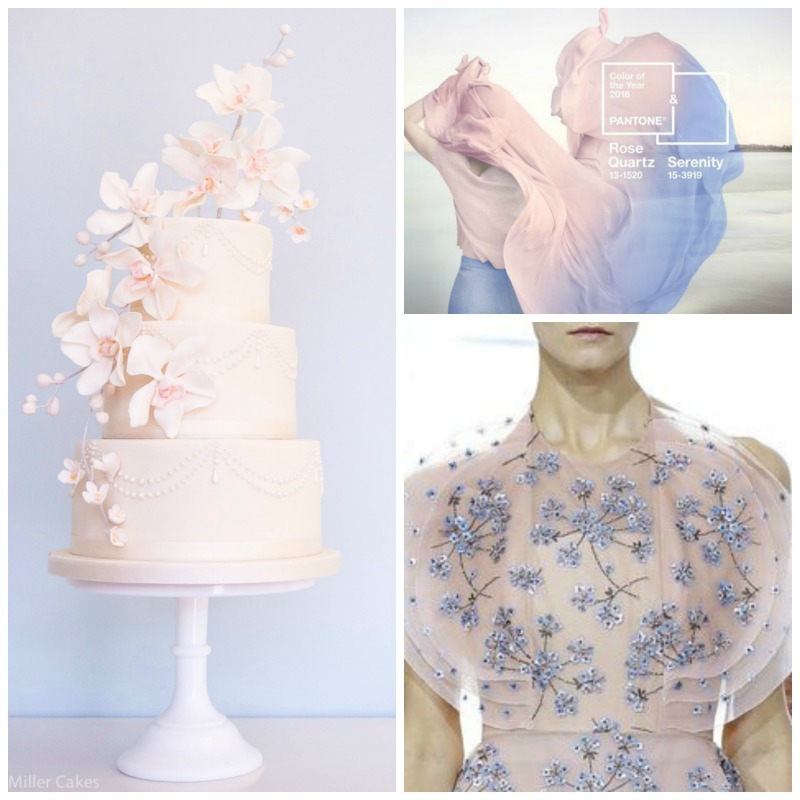
Photo Credits: Courtesy of Rosalind Miller Cakes | Courtesy of Delpozo SS16 | Pantone
During 2016, you can expect to see some combination of these colours adorning catwalk models, or smudged into an ombre infusion on the most stylish of interior walls. But the two tones are probably best suited for luxury weddings, creating a sophisticated colour palette that will look amazing in photographs.
So, how do you add Pink Quartz and Serenity to your luxury-wedding theme?
The dress
Non-white wedding dresses have become more and more popular in recent years – just look at the stunning pale pink gown which Reese Witherspoon wore for her marriage to Jim Toth; or Kate Moss’s silvery creation, which perfectly complemented the baby blue suit worn by husband Jamie Hince.
A pale pastel shade is a great way to add warmth and interest to a classic wedding dress, without veering too far into the evening wear zone. But if you aren’t brave enough to opt for an all-pink or all-blue dress, you can still make a style statement by adding a flash of colour to your underskirt, sash, veil or shoes. Alternatively you can adorn your bridesmaids in these shades; half each in Pink Quartz and then Serenity coloured gowns would make for truly beautiful photographs.
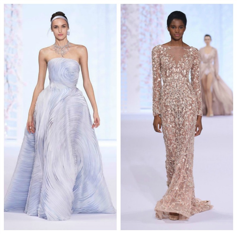
Photo Credits: Courtesy of Ralph & Russo
The décor
Delicate shades such as Serenity and Rose Quartz really come to life in candlelight, when they emit a romantic glow and bathe everything in a flattering natural filter. Choosing pastel tones for your reception décor means that you will have a dusky backdrop for all those ad-hoc evening photos, as well as creating a pretty and relaxing atmosphere for your guests.
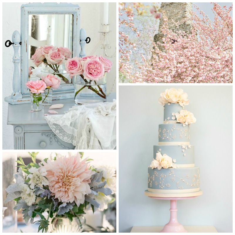
Photo Credits: From Left to Right Via AA Interior Trends | Amy Arington Photography | Jose Villa | Courtesy of Rosalind Miller Cakes
The accessories
A bouquet of pink and blue wildflowers; a dip-dyed wedding cake topped with edible jewels; rosy pink makeup with a flash of ethereal silvery-blue eyeliner – even the smallest suggestion of these colours can elevate your wedding style to the next level style-wise.
Phot Credits: From left to Right Via Gabby Taangeles | Courtesy of Sephora | Via Pinterest | Via Make Up Geek | Via Amazon | Via Acapulcoagogo | Courtesy of Sephora.
Pantone has helpfully put together a cheat sheet of colour pairings for Serenity and Rose Quartz, and they are surprisingly versatile. Whether you are planning a Caribbean beach wedding, a grand reception in a stately home, or a bohemian garden wedding, the right colours will enhance your surroundings and add a unique touch to any location.